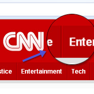
I think this is a commonly-known technique among experienced CSS developers, but many beginning web designers will probably resort to images to create this effect, which is not necessary. So, in this brief tutorial I’ll show you how to create a navigation bar with beveled edges using pure CSS, identical to that on CNN.
View the demo page to see exactly what we’ll be creating.
First, the markup, which is nothing unusual, just an unordered list:
<ul id="navigation">
  <li class="first"><a href="#">Home</a></li>
  <li><a href="#">Video</a></li>
  <li><a href="#">NewsPulse</a></li>
  <li><a href="#">U.S.</a></li>
  <li><a href="#">World</a></li>
  <li><a href="#">Politics</a></li>
  <li><a href="#">Justice</a></li>
  <li><a href="#">Entertainment</a></li>
  <li><a href="#">Tech</a></li>
  <li><a href="#">Health</a></li>
  <li><a href="#">Living</a></li>
  <li><a href="#">Travel</a></li>
  <li><a href="#">Opinion</a></li>
  <li><a href="#">iReport</a></li>
  <li><a href="#">Money</a></li>
  <li><a href="#">Sports</a></li>
</ul>
The only thing to note in that code is the class “first”, which will help us round out the effect.
Here’s the CSS for the <ul> element, which has an id of navigation:
#navigation {
  list-style: none;
  background: #b60002;
  overflow: hidden;
  width: 962px;
}
The primary navigation element above is styled with a set width, a background color, and a set height. The width is not that important, but it ensures that the element can be centered using margin: auto.
Next, we need to style the individual <li> elements. Here’s the code:
#navigation li {
  float: left;
  border-right: solid 1px #ca0002;
  height: 35px;
}
The height matches that of the <ul> element, and each <li> element is given a solid right border, the latter of which constitutes the first part of the beveled effect.
Next are the anchors inside the <li> elements. Here’s the CSS:
#navigation li a:link, #navigation li a:visited {
  text-decoration: none;
  display: block;
  height: 35px;
  color: #fff;
  line-height: 35px;
  padding: 0 9px 0 9px;
  border-right: solid 1px #990000;
  font-family: Arial, Helvetica, sans-serif;
  font-size: 12px;
  font-weight: bold;
}
The important things to note above, again, is the right border setting, which is the second ingredient for getting the beveled effect. Thus, the color of this border is darker than the border on the <li> element. The rest of the CSS shown above is trivial, making the buttons look similar to those on CNN’s website.
<
p>So, although we can’t create a double border on a single element without images, we can get around that by taking advantage of the nested elements that are part of every navigation bar, the anchor and the list item.
Next we give each button a hover state:
#navigation li a:hover {
  background: #990000;
  color: #fff;
}
The result is missing just one element. Since each button has a double border on the right, that means the leftmost button will not have a border on the left. So, we add a class to the first <li> element to give that button a left border, which completes the look:
#navigation li.first {
  border-left: solid 1px #ca0002;
}
It’s that simple. No need to slice up images in Photoshop; you can create a simple, yet beautiful beveled effect with some pretty straightforward CSS.


Hi…
Just a quick note… The last nav item seems to fall down to the next line, at least in Safari on OS X 10.6.
Thanks.
It works fine on Safari PC, but I made the nav bar a little wider to attempt to accommodate the problem you’re seeing. Thanks.
Awesome post!!. Thanks
It is nice to see some basic tutorials out there on how to achieve good workable navigation without scripts or images. I think that it is slick enough to be used on mid to high end sites and saves a bit of bandwidth. Your next one should be on a slick drop down menu that works well in all browsers using only CSS.
Cheers and keep up the good work
Kevin
Oh yeah! Good old techniques of visual games :-) Thank you for sharing.
It looks great, unfortunately on any browser on my Mac in the demo, the last tab for ‘Sports’ pushes onto the second line and by default shows a few pixel wide red bar, when you hover it then shows ‘Sports’
For some reason I thought I had corrected that issue (as I mentioned in a previous comment), but when checking again, it seems you’re right, so I adjusted it again. I hope it’s looking better now, thanks for pointing that out.
You can also acheive this by setting the left border of each li to the darker colour, and the right border to the lighter colour.
Then finish it off by doing the opposite to the container (ie the UL or another parent)
This was awesome for a new student to web design, like myself! Thanks, I now have more ideas for my class project!!!
Great post, it would be really nice to see a two tiered menu that is pure CSS. I feel that that would be difficult though. I recently posted a pure CSS slideshow on my blog here: http://www.scottgale.com/blog/css3-rounded-corners-slideshow/2010/02/19/
I love to see the direction CSS is heading.
awsome! Very good post! I just want it.
cheers for sharing this technique. thanks!
nice tutorial.
This has failed in accessibility. You should never put a height and overflow:hidden on anything text related. Increase the font size (not zoom) and the Main Menu blows up, not good.
You could have achieved the height you were looking for by using straight padding on the anchor.
R.
I like the pure css buttons…
oh! this is amazing, but i wonder how it looks with sub menu, could anyone tell me?
pd: thanks for this amazing tuto!
awesome post…thank’s before..