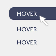
While browsing the website of well-known web hosting company Media Temple, I stumbled upon their Labs page and noticed they’re using a block hover effect on the list of items, and the hover state uses (what I assume is) the border-radius property when the background becomes visible.
There is nothing extremely unique or innovative about this effect, and some of you have probably already used it, but it’s just one of those things that, once you discover it, it really helps drive home the point that CSS3 can help us build websites that are much easier to maintain.
No More Images
In the past, to create a block hover state that had rounded corners, we had no choice but to create an image to appear on the element’s background. And if the size of the box changed at any point, we’d have to re-slice and re-export the image to the correct size.
With browsers that support CSS3, you just need the following code on your hover state:
a.button:hover {
  background-color: #fff;
  color: #fff;
  -webkit-border-radius: 8px;
  -moz-border-radius: 8px;
  border-radius: 8px;
}
On the regular link state, there is no background color, but when the hover state is activated, the background appears, and does so with rounded corners. Browsers that don’t support it will just show a square-cornered hover state, so not a big deal.
Although the effect seems pretty obvious, for those of us who are used to the old method of doing things, we may not be accustomed to thinking in this manner, and will naturally assume that we’ll need images to create this.


I tried this solution in the past: the problem is that as the anchor element is in front of the text, you cannot highlight or select (and therefore copy and paste) it. I always try to solve everything with pure XHTML and CSS, but I’d use Jquery in this particular case to change the background color property of the div on hover. Of course, this is excellent for buttons, but not for elements containing text.
It work in other browsers but doesn’t work in IE so is there any solution???
Internet Explorer does not support CSS3. But lets not let IE hold us back. More people use web browsers that do support CSS3 it then don’t.
Most people see it. Progressive Enhancement.
Honestly, I don’t even bother with trying to support IE. Whenever i design i use a browser check script and if they are running IE i send them to a page explaining why the site cannot be viewed, and why they should switch, and then offer a mobile version if they want to continue to use IE.
I have projects that require supporting IE…. (aka ichs-plorer)
The solution I have found was via jQuery plugin “corner” – found here:
http://github.com/malsup/corner
There s a javascript out there that “enhances” ie to allow rounded corners:
http://dillerdesign.com/experiment/DD_roundies/
Just make a default one for all browsers that dont support CSS3 and use this to overide the default for those browsers that support CSS3
I have a couple of div buttons and I just use the .class:hover (and :focus) – but in my case i’m using jQuery to handle the click function for the buttons because they’re swapping out and activating/deactivating different forms. You could have the LI’s light up on hover but still only the text would be an actual link, so that might create a false impression of clickability and then confuse or frustrate the user when clicking produces no results.
Just set cursor: default; on the link and people won’t notice it’s actually an anchor.
really helping technique you sharing. thanks
great article very informative, thanks for share this
Really nice tips….
Excellent example of CSS3 in action!
If you give any solution for IE it will very usefull. Thanks
thanks alot… great workk..
I’m still a newbie in using CSS and this post is very interesting for me. I hope you post more of your discoveries in using CSS.
If you don’t care about IE support – and with border-radius you automatically don’t – then why not apply the :hover pseudo-class to the li directly so that you can still have the text-selection and mitigate the issues from comment #1.
It also would allow you to have more than just a single link destination as the click. If you don’t mind losing some clickable area you gain the freedom to have links on the content in the blocks ( it would be nice to click on “Mysql Server” or “beta testing…” to get more info on the topics )
There is an online css3 border radius generator:
http://www.webestools.com/css3-border-radius-generator-moz-webkit-rounded-corner-code-maker.html
I hope that the next IE version will support border-radius.
It seems you can never learn too much about CSS. Thanks for sharing this with the rest of us!
More CSS3 Greatness! ive just used this for a coda effect popup on hover, no need for images anymore, and falls back nicely! Learning from the archives!
I am a dummy who has a problem with border-top-left-radius and border-top-right-radius. If you go to espn.com, I am trying to build a similar navmenu. The thing is if I hover mouse from navmenu li to navmenu sub1, all become rounded which I don’t like or all become squared which I have to accept right now (I have 3-level menu).
I hope you get what I mean and can help me fix that. Thanks so much.
ul#navmenu {
border-radius: 9px;
}
ul#navmenu li:hover a:hover {
border-top-left-radius: 7px;
border-top-right-radius: 7px;
}
ul#navmenu li: visited a {
border-top-left-radius: 7px;
border-top-right-radius: 7px;
}
ul#navmenu .sub2 li:hover > a {
border-radius: 0px;
}
You’re going to have to show an example. But my first instinct is that you have an error in your code. In the third declaration block above, you have “ul#navmenu li: visited a”. That can’t be right. It should be something like “ul#navmenu li a:visited”.
The best thing for you to do is put your code into a demo page, using JSBin.com or Codepen.io, or something like that, and then I can fix it for you.