Design that is arbitrary and unplanned might succeed simply because of its ease of use, or its familiarity. But design that is well thought out and planned with specific goals in mind has the potential to cause users or customers to make decisions that they might not normally make.
Yes, I suppose this is a form of manipulation and some people might not agree with it. But I think as long as you stay within certain boundaries, manipulation through design doesn’t cross any lines, and it’s really just a tool at the disposal of the website/owner/designer.
Demonstrating Persuasion Through Design
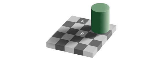
To illustrate the potential power of design, take a look at the image shown below. I’ll be honest here. I can’t give proper credit to who created this image, because I copied it from one of those cheesy online advertisements that makes you go through a quiz and then asks for your cell phone number in order to text you the results (and evidently you can find this image on many websites, so I don’t think it’s a big deal).
I don’t remember what the ad was, what website I found it on, or anything else about it (goes to show how pointless the ad really was). But here it is:
Which Square is Darker? A or B?
The answer, as you’ve probably figured out, even without pixel sampling, is neither. Square A and square B are exactly the same color. (NOTE: Because of JPEG compression, and the fact that I had no control over the original image, the squares may not be pixel for pixel matches, but generally speaking the color of square A matches that of square B.)
How Can This Technique Be Used?
There are probably some things at work here that I don’t fully understand, but the basic reason that that square A looks darker than square B is contrast. The surrounding squares create the illusion that a square is darker/lighter. There’s also the shadow cast by the green cylinder that factors into the visual.
It’s obvious (at least to me) just from this simple example, that the way something is designed has potential to have a strong effect on the decisions people make. The snap decision of the average person looking at that visual is “A is darker”.
In the case of this pointless image (and the pointless ad from which it came), the results are trivial. But the potential encapsulated within the results of that snap decision could be enormous if harnessed through a vigorous marketing campaign for a quality service or product.
What do you think? Is manipulation through design a good thing? Is it possible that “fooling” the eyes in this way could be viewed as unethical? Or is that just part of how the human brain and its perceptions work, and we should just deal with it?


This isn’t the power of design. This isn’t persuasion either. This is a property of human visual perception. Simply showcasing this property can not be viewed as unethical.
It is the way one uses design that should or should not be considered manipulative. Trying to change the public’s perception — NOT visual perception — of a product, commonly referred to as marketing, can often be described as manipulative. The real question is when this manipulation become unethical, a topic that is really quite unrelated to your visual ‘demonstration of persuasion’ above.
Design is just one of many tools that marketers may use to influence your perception of a product. Was the good design of the first iPhone manipulative because it made itself look better than other phones? I don’t think so.
All design is manipulation. Some is just better than others.
The design of the iPhone wasn’t manipulative. The marketing of it was, because they announced everything about is as if they had cut it from whole cloth, when it was just a conglomeration of ideas and technologies others had invented packaged up prettily and with a convenient, enforced mode of operation and interaction with software on the computer. It was marketed as sexy and glamorous, something uncommon.
The design of this website is meant to manipulate a person into believing that the blog owner is an authoritative voice on the subject of design – but only by examining the articles and testing the principles presented can one determine whether the author knows what he was talking about or just bought a nice design to pimp his site. (For the record, I wouldn’t be reading if I didn’t think there was knowledge to be gained.)
Design can be visually manipulative – if you photograph something in way to make it look better than it does in real life (think HDR with super color saturation and intense contrast) and throw in some hot models to imply that the product will make you attractive to the opposite sex (or in some cases, provide an ideal that you wish to be), you’ve designed your advertising to lure in people and make an irrational decision – but is that visually based or just keying into people’s subconscious desires?
Ethics, or lack thereof, is a fairly subjective matter, codified into law or not. We consider it unethical to kill a human, but have no problem sentencing killers to death, or having the police kill in the line of duty if they feel their life is on the line. (Yes, not everyone agrees with this – but not everyone agrees that it’s unethical to kill a human. Like I said, subjective.) And, if you had to take one innocent life to save the lives of an entire nation of people… where do your ethics stand on that?
Sorry, didn’t mean to get all philosophical on this, but the subject is murky. What if your design is meant to get people to do something about global warming, malnutrition in poor countries, orthe genocides going on around the world that they wouldn’t normally care about. Is that ethical? Depends on your viewpoint. :D
Thanks for your thoughts, Nick.
I don’t really consider myself an authority on the subject of design. I rarely write about design principles, but when I do, it’s usually with the recognition that I’m not the final authority on the matter. This was just an interesting image that I’d seen, and I thought it would be an interesting subject to hear people’s thoughts on.
From Webster’s:
ma·ni·pu·late – Pronunciation: \mə-ˈni-pyə-ˌlāt\
2 a : to manage or utilize skillfully b : to control or play upon by artful, unfair, or insidious means especially to one’s own advantage
I like to think of Luke Skywalker when I hear the word “manipulation” in terms of marketing. He has the power to use the force for good or evil. Yoda keeps Luke on the right path through “honest persuasion” – using the force for purposes of good. Then big bad Darth comes along telling Luke to join the dark side so that he can use his manipulation skills for the purposes of “deception”.
If you know what you are doing, you can powerfully use manipulation to control the thoughts and actions of your audience. Of course we would only use the force of manipulation to save Princess Leia. But you should be careful not to surrender your manipulation skills to the dark side!
Design is manipulation. As a designer, you are intellectually and, to an extent, physically trying to manipulate your users into seeing information in a way that benefits their experience.
Certainly, manipulation sounds like a bad thing, but if it’s in the name of a better experience, then I think you’d be hard pressed to find a user who objects.