
Occasionally, while reading or doing research, I still stumble upon “classic” web design articles. So I thought it would be a great idea to list what I feel are some of the most important articles that have been published in the relatively short history of the web development industry.
Originally, I had started with the idea of listing 10 articles — but when I began the research, I slowly started to realize that was not going to do justice to this list. So I settled on 25. I think this is a good collection of some of the more significant articles that have been produced over the past 13 years or so.
I know I’ve left out some good ones, and I’ve probably included a few that you personally feel shouldn’t have made the cut — so I will look forward to reading everyone’s comments to hear of any that I missed!
I tried to make the list diverse, so some of what I’ve included technically wouldn’t even qualify as an “article” — but I felt their importance was strong enough to justify their inclusion. And no matter how hard I tried, I couldn’t stop A List Apart from absolutely dominating the results. I also included a few modern classics that I felt were a good addition.
The list is in chronological order by original publication date (or else the earliest date according to archive.org and marked with an asterisk). If anyone has a more accurate publication date for any of the items with an asterisk, please contact me.
I’ve said enough! Please enjoy this trip down “web design and web standards” memory lane.
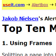
1. Top Ten Mistakes in Web Design
Original Publication Date: May, 1996
My article from May 1996, Top Ten Mistakes in Web Design is still surprisingly relevant today… The article has become a minor Web classic with about 400,000 page views so far [in 1999].
2. Revenge of the Menu Bar
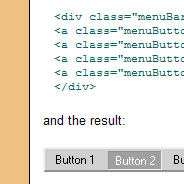
Original Publication Date: January 24, 2001 *
This article details the construction of a menu bar like the one used on the main pages of this site. It’s built from standard HTML elements using CSS to define the look and layout and JavaScript to handle the action of the drop down menus.
3. HTML Utopia! Design Websites Without Tables

Original Publication Date: April 12, 2001
A few weeks ago I stumbled upon a site that really inspired me. It was beautifully designed and presented. It was not until I looked at the code behind it that my heart truly skipped a beat.
4. CSS Design: Size Matters
Original Publication Date: May 11, 2001
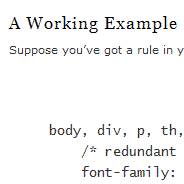
The Cascading Style Sheets (CSS) standard includes seven font-size keywords intended to give designers a simple means of setting font sizes without creating accessibility problems. Sizes range from xx-small to xx-large and are relative to users’ preferred “medium” settings.
5. Box Model Hack
Original Publication Date: June 2, 2001 *
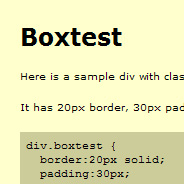
User agents which misinterpret the CSS1 box model by placing border and padding inside the specified width would result in a total width of only 300px, and a content width of only 200px.
6. CSS Talking Points: Selling Clients on Web Standards
Original Publication Date: July 6, 2001
To advance Standards it is critical to start building [standards compliant] sites for real, paying clients, not just for ourselves. A solid Party Line will help us present [standards compliance] to our clients not as something scary, but as a natural “best practices” approach to building their website.
7. Doctypes and Their Respective Layout Mode
Original Publication Date: July 21, 2001 *
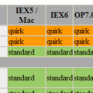
Doctypes and their layout modes in various browser versions.
8. Complex Spiral Demo

Original Publication Date: September 20, 2001 *
Remember: as you look this demo over, there is no Javascript here, nor are any PNGs being used, nor do I employ any proprietary extensions to CSS or any other language.
9. Alternative Style: Working With Alternate Style Sheets
Original Publication Date: November 2, 2001
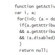
These style sheets can be selected by the visitor as alternatives to the preferred style sheet. This allows the visitor to personalize a site and choose his or her favorite scheme. They can also be used for accessibility.
10. Flash of Unstyled Content (FOUC)
Original Publication Date: December 12, 2001
Some pages that use the CSS @import rule experience a curious display quirk in the Windows version of MS Internet Explorer: a momentary flash of unstyled page content. The unimaginative creature that I am, I call this phenomenon Flash of Unstyled Content or FOUC for short.
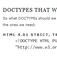
11. Fix Your Site With the Right DOCTYPE!
Original Publication Date: April 12, 2002
You’ve written valid XHTML and CSS. You’ve used the W3C standard Document Object Model (DOM) to manipulate dynamic page elements. Yet, in browsers designed to support these very standards, your site is failing. A faulty DOCTYPE is likely to blame.
12. IE6 Peekaboo Bug

Original Publication Date: July 7, 2002
A liquid box has a float inside, and content that appears along side that float. All is well, until it’s viewed in IE6. “Wah? Where’s my content?!” You reload the page, and nothing. When you scroll down, or perhaps switch to another window, upon returning to the ‘scene of the crime’ there it all is, fat ‘n sassy!
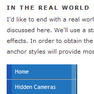
13. CSS Design: Taming Lists
Original Publication Date: September 27, 2002
In this article, I’ll demonstrate how to use CSS to bring unwieldy lists under control. It’s time for you to tell lists how to behave, instead of letting them run wild on your web page.
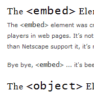
14. Flash Satay: Embedding Flash While Supporting Standards
Original Publication Date: November 9, 2002
When I recently published a site in XHTML, my dissatisfaction with the markup grew as I realized that it simply wasn’t valid in this context and was bloating my pages to unacceptable levels. A leaner, standards-compliant method of embedding Flash movies was called for.
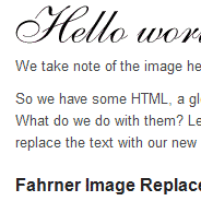
15. Using Background-Image to Replace Text
Original Publication Date: March 7, 2003
With a few simple style tricks and a little cautious planning and testing, type on the Web can be guiltlessly beautiful and equally accessible and perfectly indexable, all at the same time.
16. The Box Model Problem

Original Publication Date: June 21, 2003 *
When breaking out of using tables and moving toward using Cascading Style Sheets (CSS) positioning for laying out elements on a page, it is important to become familiar with the W3C Box Model. At first, the box model may be confusing, but it is a necessary concept to grasp.
17. Sleight of Hand (Alpha Transparency in IE5.5+)
Original Publication Date: July 8, 2003
I’m sure most readers are aware of of youngpup’s Sleight code snippet for achieving PNG alpha transparency in Win IE 5.5+ … On a project today, we wanted to implement a translucent PNG effect on some dropdown menus. Youngpup’s code only deals with inline images, not background images so I had to roll my own.
18. Fast Rollovers Without Preload
Original Publication Date: July 8, 2003
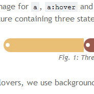
When using CSS image rollovers, two, three, or more images must be loaded (and often be preloaded for best results). We’ve got one image for each state (normal, hover, active, visited etc). Putting all states into one image makes dynamic changes faster and requires no preload.
19. Sliding Doors
Original Publication Date: October 20, 2003
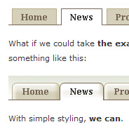
It’s time to take back control over the tabs which are continually growing in popularity as a primary means of site navigation. Now that CSS is widely supported, we can crank up the quality and appearance of the tabs on our sites.
20. Faux Columns
Original Publication Date: January 9, 2004
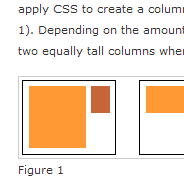
One of the questions I get asked the most often regarding my personal site’s design is the following: “How do you get the right column’s background color to extend all the way down the page?” It’s a simple concept, really — one that many of you may already be familiar with. But for those who aren’t, the following technique can be a handy little trick.
21. No More Tables

Original Publication Date: July 21, 2004
Data (Good).
Layout (Not so Good).
22. Nifty Corners: Rounded Corners Without Images

Original Publication Date: March 16, 2005
Rounded Corners with CSS are a hot topic in web design: I think that there are hundreds of articles on them. This page is intended to present the solution I came up, that doesn’t requires images, extra markup nor CSS.
23. On Having Layout
Original Publication Date: June 30, 2005
A lot of Internet Explorer’s rendering inconsistencies can be fixed by giving an element “layout.” In this article, the authors focus on some aspects of this complicated matter.
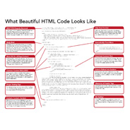
24. What Beautiful HTML Code Looks Like
Original Publication Date: November 1, 2007
I have an addiction. I can’t help but view source on every nice looking website I see. It’s like if you had x-ray glasses that allowed you to see any person you ever saw in their underwear at will. How could you not?
25. Do Web Sites Need to Look Exactly the Same in Every Browser?
Original Publication Date: December 12, 2007 *
[Web sites don’t need to look exactly the same in every browser.]


Thank you so much for posting this. This gives me some ideas on how to create my own CSS-website.
It’s been fun reading this articel and interesting to see how long this debate actually runs. Thanx for the collection.
Really, from the beginning to the end! Every web related people should know.
This was a very informative article. It’s nice to see all of these classic, yet pertinent articles in one place.
However, I was almost persuaded to leave your site without visiting some of them because your site is constructed in such a way that forces me to open the link in a new window and go to that window.
You should take some of the usability advice of the author of #1 and allow your visitors to choose how to open a window. Don’t choose for them.
http://960.gs/
Can’t say the grid is everything/everywhere, but it made an impact in the design community.
Well. I’ve been in this game too long. Most, if not all of these, I’ve already read. Then I’ve re-read them, and probably gone back to them on and off for many years.
There are some really excellent picks here, and I can’t really remember any that springs to mind which should have taken up any of the places on the list.
@rae: you can perfectly well chose how you want to open the links on the page. At least if you use a decent browser ;) All I have to do is either right-click and chose “open in new tab” or just Ctrl-click on it, and it opens in a new tab. Different browser windows is a thing of the past, or Internet Explorer, mostly :)
thanks for posting the article… very very interesting. still got lots of point to be consider.
Very interesting and informative article!
Ovi Dogar
AbsoluteCovers.com
thank you very much for sharing! This article remind me something basic but important.