Articles By: Louis Lazaris

Getting Buggy CSS Selectors to Work Cross-Browser via jQuery
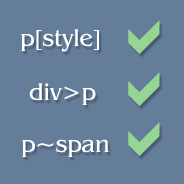
Getting Buggy CSS Selectors to Work with jQueryAlthough the lack of cross-browser CSS selector support has caused a number of useful CSS selectors to go almost unnoticed, developers can still manipulate styles on their pages using some of these little-used selectors through jQuery.

Below I’ve prepared a simple table that describes a number of CSS selectors that are not cross-browser compatible, along with the jQuery syntax for each. The syntaxes are exactly the same as they would be in CSS, save for the jQuery wrapper (just remove $() and the quotes to get the CSS syntax), so using these selectors in jQuery will provide somewhat of a practice ground to prepare you for when they’re fully supported by all commonly-used browsers.

Recreating CNN’s Beveled Navigation Buttons with Pure CSS

Beveled Navigation Buttons with Pure CSSWhen CNN recently redesigned their website, they created a strongly-branded and beautiful header section that includes a navigation bar with beveled buttons. Although CNN’s navigation bar utilizes CSS sprites for highlighted and active buttons, the primary design of the buttons (the beveled effect) is done with pure CSS.

I think this is a common-known technique among experienced developers, but many beginning web designers will probably resort to images to create this effect, which is not necessary. So, in this brief tutorial I’ll show you how to create a navigation bar with beveled edges using pure CSS, identical to that on CNN.

A JavaScript Content Switcher That Works Without JavaScript

A JavaScript Content Switcher That Works Without JavaScriptRecently, while doing research/work on a completely unrelated topic, I came across the beautiful illustrations on Rype Arts, which are displayed inside of a JavaScript-driven content switcher. For some reason, I happened to visit the page with JavaScript disabled and noticed that the content switcher was still working (albeit, with a few flaws).

At first I couldn’t figure out how it was functioning. Normally, with JavaScript disabled, this type of content switcher (or content slider) will just display one item, or else display all items, without allowing any “switching” functionality. After some poking around, I realized it’s not a very difficult thing to do. The switcher utilizes in-page anchors and overflow: hidden to keep the switchability intact.

Screencast: Why You Shouldn’t Use CSS Font Shorthand

Screencast: Why You Shouldn't Use CSS Font ShorthandStarting today, and pending the work involved and subsequent success/failure, I will be regularly posting screencasts on Impressive Webs. Most of my writing time is spent authoring stuff for Smashing Magazine and Web Designer Depot of late, so I thought, as a change of pace, I could start doing some screencasts for my own site.

The inspiration for this idea, naturally, comes from the screencasts on Nettuts and CSS-Tricks. Jeffrey Way and Chris Coyier have been doing screencasts for quite some time, and I definitely have to give credit to them for the inspiration. I’ve especially enjoyed Jeffrey’s recent video quick tips on Nettuts.

CSS3 Click Chart

CSS3 Click ChartSince my knowledge of CSS3 is fairly shoddy, I decided to create and release a CSS3 “click chart” or “help chart” (for lack of a better term) that displays examples of some of the newest features in CSS.

The initial release only has 8 examples, with more to be added in the future. Each example visually displays the CSS3 feature, with a clickable heading that opens a box at the bottom of the page for information on that particular feature.

The box that opens gives a description along with browser support, an external link (usually W3C info), and some example syntax taken from the CSS of the page itself.

New Website Launch: Interviews by Design

New Website: Interviews by DesignToday I’m happy to announce the launch of a new project I’ve been working on since late December. It’s a simple website called Interviews by Design that will be a repository of 5-question interviews conducted with designers from around the world.

The name has a two-fold meaning: (1) The interviews are conducted with designers; (2) Each interview asks the same five questions, thus they are in that format “by design” (meaning done intentionally).

And I should probably give credit to Chris Coyier of CSS-Tricks for popularizing the 5-question format in the design niche (although he may have borrowed the idea from another blogger or Craig Kilborn, I’m not sure).

A Stationary Logo That Changes on Page Scroll with CSS

A Stationary Logo That Changes on Page ScrollThe Econsultancy marketing blog has an interesting little effect using CSS that causes their logo to change when the page is scrolled. Visit their page and scroll down. You’ll notice the logo changes from a solid version to an outline version.

If you know CSS fairly well, or have investigated some of the sites on css Zen Garden, then you’re probably aware that this technique uses the CSS background-attachment property.

Response to “In Defense of Vertical Navigation”

Response to In Defense of Vertical NavigationIt’s been quite a start to this week since the publication of my article on Smashing Magazine called The Case Against Vertical Navigation. I really didn’t expect this type of response. I assumed that what I was stating was a fairly commonly held view among designers.

Since there have been a lot of criticisms of Smashing Magazine over the past year (mainly because of endless “list” posts), Vitaly Friedman was more than happy to publish an opinion piece on a specific aspect of design. So, if you haven’t read the original article yet, please do. And please read Kyle Meyer’s response to my article, which I will be responding to here.

I’m glad Kyle posted his response; as Jacob Gube mentioned in both SM’s comments and on Kyle’s site, this type of discussion is good, regardless of who is right and wrong.

Deep Linking in JavaScript and Ajax Applications

Deep Linking in JavaScript and Ajax ApplicationsLast week I posted a tutorial that demonstrated using a simple application how to implement progressive enhancement into your Ajax projects. The one major flaw in the final Ajax-driven page from that tutorial is the lack of deep linking when JavaScript is enabled.

Although the resulting code is clean, works well, and is easy to maintain, the lack of deep linking is enough to cause a client to balk at the use of progressive enhancement in such a circumstance. So, in this brief tutorial, I’ll describe how to incorporate deep linking into that page.

If you haven’t already gone through the previous tutorial, doing so might help you get up to speed — but it’s not absolutely necessary, since the code we’ll be using is pretty straightforward.

Building an Ajax Application with Progressive Enhancement

Building an Ajax Application with Progressive EnhancementIf you’ve done your best to keep up with web development trends over the past five years or more, then it’s likely that you’re familiar with the concept of Progressive Enhancement. I’m not going to provide an explanation of that technique here, but instead, I thought I would demonstrate using a small Ajax-driven page how progressive enhancement can be implemented.

The mini-app we’ll be building in this tutorial is an employee information page. It will consist of a series of links at the top of the page that will determine what employee info is displayed in the content area. The information will be held inside of include files, to simplify the process (as opposed to a database or XML file which might be more practical in a real-world app). Although we’re going to use Ajax to display the information, we’re going to ensure that the same information is displayed even when the user is visiting the page without JavaScript capabilities.