font shorthand property, so I feel I should make up for it. After all, the font shorthand property was just minding its own business, trying to save developers some lines of code, and I come along and declare it an outcast. So, although I still don’t agree with ever using font shorthand, I do think it’s important that CSS developers understand how it works.
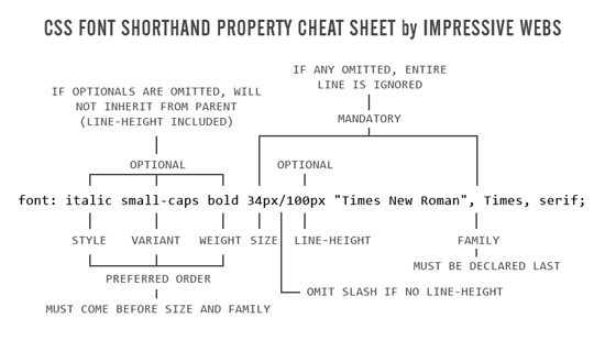
So to make up for my former font shorthand hostilities, I’ve prepared a printable cheat sheet that you can download and hang next to your computer, which will come in handy in case you decide to use this property yourself, or are forced use it in a stylesheet from an inherited project.
Enjoy!


Aaah nice guys! Been looking for a proper shorthand for styling fonts for some time. Will use this one from now on, thanks a lot!
Great!
Been too lazy to learn this. But that was really well written and described. Now i have a good picture of it in my head so i dont think ill forget how to use it!
Best Regards,
William Astrom
Great resource to add to my library, thank you.
awesome, like most, I was too lazy to learn the short hand.
Yeah, this is a great shorthand to use; it saves a lot of time. The font one is probably the trickiest to remember, followed closely behind by background and list-style (just because anything other than “none” is rarely used).
Nice, even look simple but very useful…
thank you
really helpful, thank you
Hi, I just viewed the screencast where you expressed your opinion on the shorthand font property, and although I appreciate your view on the topic, I don’t agree with the animosity simply because of the fact that it behaves exactly like other shorthands. You can’t really leave empties on margin or padding for example. If you do, you get a default value equal to the value of the opposite (top ~ bottom, left ~ right). In shorthand font it’s the same though since there are no “opposites”. It’s the most valid route to take for the browser, which can’t know if you want to inherit if you don’t explicitly tell it to. Margin and padding don’t inherit a value for any side if you don’t declare it in the shorthand property, why should font be any different?
That being said, all shorthand properties have some quirks that define their usage. Although it’s not a rule, you could say that shorthand methods are useful to declare the base styling of a “section” or to redefine a block completely from within a section.
Ex: You define your font (with the shorthand method) properties in the outermost block, and redefine with longhand as you go in the innerblocks. This is also the way to go for other properties with shorthand and multiple longhand methods for defining themselves.
Lastly, regarding beginners, when I first learned shorthand I found the structure of “font: bold italic variant size/lineheight font-family” a lot easier to remember than all the “features” of the background shorhand. I’m just saying….
Hey Jaime, thanks for chiming in here. Some valid points, and i definitely see what you mean about learning font shorthand early on, which is good. However….
The problem with your comparison to the other shorthand values, is that there really is no comparison. Yes, they do behave the same way, but those behaviours are inconsequential. That is, they will rarely cause problems.
When a developer sets the
backgroundproperty in shorthand and leaves out the “color”, it doesn’t have any effect, because there is no other background color being declared for that element anywhere, and he doesn’t expect it to be that way.The same is true with the
list-styleproperty. Although the type of list marker and position might be left out, it doesn’t matter if it gets reset, because there is no setting for that to inherit anyhow.And padding and margins, as you explained, are logical because they inherit the value of their opposite, so it works and it’s intuitive.
The font shorthand is not like those, because child elements should inherit typographic settings from their parents, so the way it behaves is unusual (even if, technically speaking, it’s the same as the other shorthand values).
The font one is probably the trickiest to remember, followed closely behind by background and list-style (just because anything other than “none” is rarely used).
really helpful, thank you
Nice, even look simple.
That’s a good thing. I’ve looked for such a shorthand compilation a long time. Thanks
Hi.
Instead of
34px/100px
for size/line-height, consider using
34px/3
In this form, line-height acts as a multiplier. This makes your code a little more elastic/accessible/responsive. Funny enough, line-height is the only css property takes a non-zero number with no unit.
Details here:
http://webtypography.net/Rhythm_and_Proportion/Vertical_Motion/2.2.1/
Thanks for pointing that out. I had actually forgotten about the no unit value with line height, which works similar to percentage values. I’m way too accustomed to using pixels for all values, which is probably not a very good habit.
I am very new to the net and needed to research this subject. Thought it was a great blog very well written and helpful. I will definitely be coming back to your site to read more posts as i adored this one..
nice one… thanks for this one.. make everyone lives easier… thanks again..
Great resource. Thanks for sharing.
Love it. Just what I needed to teach my students this rather complex shorthand.
Thanks. I find that “/” between size line-height helpful too.
can we use !important at the end of this shorthand method?
That’s actually a good question…. I would assume the answer is yes, but would be interesting to confirm, and see if there are any bugs. I will post a comment here once I’ve tested it.
I’ve now tested this, and yes,
!importantdoes work at the end of a font shorthand property, as is expected.Interestingly, if you accidentally put a comma before the !important keyword, then it won’t work, because it’s looking for another font family (the font family is always listed last in shorthand). But if you add yet another !important keyword at the end, it still doesn’t work, so this would be invalid:
It seems like the above code should work, because the 2nd last use of !important should be treated like a font-family, but that doesn’t seem to be the case.
What about colour? Surely this is not omitted from the rule? Seems pointless having a shorthand that doesn’t meet all the properties. Tried in a few positions but bit breaks. Can anyone confirm this?
Cheers
That’s actually an interesting observation because, technically “color” affects anything in the foreground, which is almost always text content.
But that’s not all it affects. Take the following CSS:
The element above will not only have red text, but will also have a red border. The “color” applies also to the border, which doesn’t have a set color.
More info here: http://reference.sitepoint.com/css/color
Hi I was wondering your reason of why you don’t agree with using shorthand. I tend to always use the longer version but have been told not to by another developer so I want to find what is the industry standard.
Alexa, it really doesn’t matter. Some people are obsessed with the idea of writing very terse CSS, Javascript, or other code. Some do it because they are control freaks, some think it optimizes( if you are using any form of decent content compression, it’ll remove redundancies itself ), while others do it purely because they think its “the right way” and it makes them feel superior because the write hard to read code.
Personally, I avoid any syntax that is fragile ( like font short-hand, it breaks easily ) and less informative of intent. Many other CSS styles allow things in no particular order, so why this? Making special cases is a bug not a feature.
I think it would depend on what you are more comfortable to use when doing your work. Some would think that terse CSS is far much better than doing the longer version of it. I believe that as long as it works, and you are confident that your parameters and syntax are correctly put, then all is good. These are points added to our help-codes that may come in handy someday. My take…Keep it coming!
ou, i should use “weight” before “size” in the font-shorthand.. now i know why does the weight/size does not appear
So why can’t you add color into the mix… ho hum.
Because the color property is not just for text. See the above comment:
http://www.impressivewebs.com/css-font-shorthand-property-cheat-sheet/#comment-8385
As well as:
http://www.impressivewebs.com/css-color-property/
Thanks for this. It’s hard to remember the order. I also use the colour property outside of the font shorthand.
CSS Font , a detailed study
http://www.corelangs.com/css/text/fonts.html
CSS tutorial
Good job! Man
Thanks so much for this. Dunno why I can never keep this in my head after all these years, but the CSS font shorthand property cheat sheet is a lifesaver!
I have to say out of the many and I mean many tutorials I have read, this is the best. It doesn’t put me to sleep and I want to memorize every section! I wish I could , thank god for the bookmark page and notes. Seriously, thankyou for the work you put into this. One of the things that must be hard with teaching HTML and CSS is you have to go through the whole process for people to really get it. You have done a great job and you have helped many people. Thanks
Hi Louis,
Size and Family are not mandatory, see my comment on CSS-Tricks: https://css-tricks.com/almanac/properties/f/font/#comment-1600730
Hey Thierry, thanks for mentioning this. I guess I just never took the inherit keyword (or similar) into consideration. I’ll update the post, but I would say that, in a sense, the rule still applies, with the exception of the use of what the spec now calls defaulting keywords.
Most of those didn’t really exist when I wrote this post, but I should have taken the inherit keyword into consideration. But that being said, when I wrote this, inherit wasn’t usable because it wasn’t supported in oldIE.
But thanks, I’ll see about writing an update.
Thanks for posting that cheatsheet! Just what I was looking for.