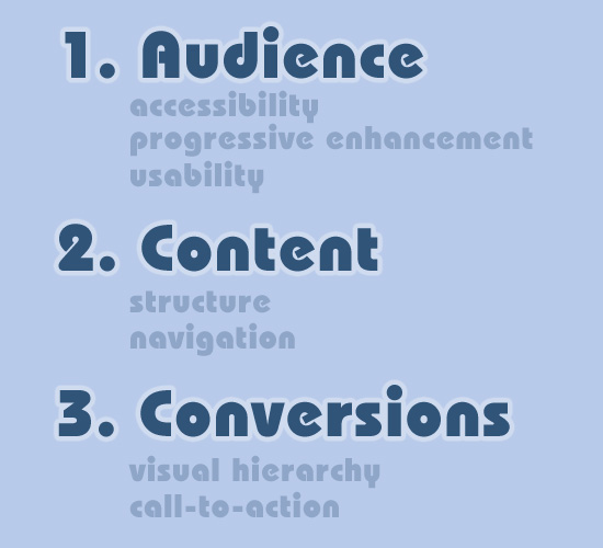
This topic doesn’t necessarily need a long explanation of the three main points, so I’ll just list some factors for consideration by way of an “infographic” (or at least, my own pathetic attempt at one).
I think these three areas are arguably the most important to consider when preparing for a new design. I stress that these are pre-design considerations.
- Audience (accessibility, progressive enhancement, usability)
- Content (structure, navigation)
- Conversions (visual hierarchy, call-to-action)
What do You Consider Before Starting a Design?
So much could be said about each of the points and sub-points listed above. Are there any other important factors to consider when preparing to design something new? Feel free to give your feedback.


Hi,
I would like to add two more thing into design which is
simplicity
navigation
Thanks
I would say both of those qualify under usability (which is already mentioned in the 1 point), but a good reminder anyway
I swear some ppl just comment in order to say something, anything. pffft!
I would say 2 thinks creativity and inspiration
i swear that you are so smart to comment on something that u didint understand
Almost all conversion goes through web forms, so perhaps it would be wise to think about that pre-design. It’s a world of change when asking for just what you absolutely need instead of what you want to know. It’s the difference between two fields in the sidebar or a complete registration form.
Web forms are equally part of conversion and usability.
Grtz. Jeroen
I would think the MOST important is #1.
Accessibility is one of the thing that I think a lot of people struggle with when designing a website. As designers or developers we don’t normally think about the audience and how a lot of them might not be the best at finding their way through websites. We need to take this into consideration when designing and think about what common sense might be fore someone no so computer savvy.
Excellent post! I have realized lately that I put minimal time into this, and therefore have a lot more work later on trying to get my designs and code to fit into these dimensions after the fact. I started thinking the other day how I could improve this process, and viola, your post arrives!
really awesome post….keep it up
wow. its nice post. impressive.
This is superb one, because most of the don’t have time to read a lengthy article. This kind of work will reduce the time…
Great article-I always have this discussion when I start with my clients “what is their audience” because it comes down to design style, effects, usability to match their market.
The distressing thing is that most client never thought of it-and one has to really spend time discussing it with them. I have encountered clients who prefer a look that is very dated or does not match their target markets at all. That may not initially a problem, but will down the line when they start to compare their site with the competition.
3 is sufficient.
This post could of had 10.
sure but think the most important part is the designer………….but nice
Is it important to have a concept?
I like those points. But what about the use of colors and lettering. Honestly I would like to know more about these things