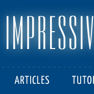
This design didn’t take me too long, since the basic structure and layout of the site is still somewhat the same. I think it’s a little cleaner and more professional looking, and it was certainly influenced by some of the great designers I’ve observed over the past year or more while blogging regularly.
I’m hoping that certain features of the design will allow for creativity within individual posts at any time in the future, should I decide to venture into that area of design blogging.
Features of the New Design
- Centered-logo header, which is something I’ve noticed and liked on many sites
- New logo, created with a font called “Empire BT”
- Collapsible header (I may incorporate cookies to save the state)
- Some CSS3 transitions for the rollover colors on the main nav and post headings
- HTML5 doctype, but I haven’t incorporated any HTML5 features yet
- Headings use a font called Yanone Kaffeesatz, from the Google Font API
- Because the headings font is unusually sized, I’m using a JavaScript plugin to ensure the font stack doesn’t break the layout
- Overkill on dashed lines
- As far as I can tell, works in every browser, with some small issues in IE6
There are still some small details that I will iron out over time, but generally, I think it’s an improvement over the last design.
What Do You Think?
Go ahead and offer your comments, criticisms, observations, or any bugs you notice in any browser. I have not tested on a Mac, so maybe my statement that the design looks good in every browser is a little hasty. But I feel pretty good about my cross-browser abilities, so I think it should be fine. Maybe I’ll eat my words.


It’s a nice design, very clean. My one concern is the width. You’ve possibly considered this in your design, but a possible solution is different CSS sheets for different sizes. I’ve only just come across these so I’m still a bit hyper about them but this seems like an ideal solution to use one to cater for smaller browsers.
This is what I mean: http://css-tricks.com/resolution-specific-stylesheets/
Apart from that, good job!
Since this is a blog, I think that designing for yourself is much more appropriate. I’d also understand that designing for yourself equates to designing for your audience.
Keep it simple, I always say. There are too much design blogs that just keep adding way too much.
The width on the right column is a bit too wide also.
Overall 7.5/10
I have my browser window sized so 960px sites display perfectly — window.innerWidth is kept at or around 1020px.
This site doesn’t fit at all and thus looks bad. Amateurish, I’d say. Maybe enough to make me unsubscribe from your RSS feed. D:
kyle,
Thanks for your input. The 960px width thing has been a standard for some time, but there’s no reason that we can’t move on from that (the same reason we moved on from designing for 640×480). In fact, if you look at some of the most popular design blogs, they’re almost always bigger. Although I do like how Nettuts+ now resizes the width of the site depending on the user’s browser size.
Nonetheless, since others said the size of the sidebar was too big, I made it smaller, and decreased the width of the site by about 60px.
Maybe you should cut off the sidebar width a bit, it makes the site too wide. Your reader’s attention is less focused on the artice if you have a similar width in post and sidebar.
Gotta love the post title’s font!
I agree with Alan. I think the side column on the right might be too wide. The focus should be more on the content.
Other than that, I’m loving the really clean design.
There’s basically no left hand gutter. It’s kinda of weird. I’m also side scrolling right now. Chrome 6, OS X 10.6.
Thanks for everyone’s input. Seems the biggest weakness is the large sidebar, so I will be fixing that to accommodate smaller resolutions a bit better.
Thanks!
I actually like the design better when the header is collapsed although the font on the name becomes almost unreadable at that point. for some reason when the header is expanded the top seems to be off center. I guess it is likely due to the 3/4 split below but.. it is overall a nice clean design
Actually, the header is not exactly centered, good eye. The reason is that the large “CSS” letters on the right are 1 character smaller than the “HTML” letters on the left.
So, I have a choice: I can center the header using the logo alone (the prime element), or count the decorative parts (HTML & CSS) as part of the centered header, and center according to that. But then the main logo will look off center.
I think the best solution would be to use “CSS3”, to even it out, which I may very well end up doing. Thanks for the input.
Love it!
I especially like the use of wihte (light gray) space, the fonts and the width of the site. I agree with you that we must move on from the 960px designs someday, more “bigger” sites will help to move on faster.
I would leave the IE6 issues in there, theese people deserve to be punished for surfing with a browser that barely is a browser anyway :P
I like it.
Very clean design and good choice of color scheme.
Collapse/Expand header is a nice effect.
Nice site. Obviously the right rail is a little too wide. The only other thing I don’t like is that you have no left gutter. Elements seem to be pressed against the edge of the client window. I think there should always be at least 3px (I prefer 5 or 10 depending on the site, but unless you compensate with the width of the right rail, the page will be too wide in this case) between the left edge of the browser and any content. Also, I’m viewing with firefox 3.5 and your background for your footer doesn’t span the width of the footer: you have text hanging off the edge of the background. Other than that, I think it looks great. Keep up the good work!
Hey, Jim.
Thanks for the heads up on these issues. I realized that these problems are only occurring on smaller browser windows, so I’m in the process of creating a style-sheet override via JavaScript that will fix these issues and make the width of the site smaller for smaller viewports (which usually results from smaller resolution or non-maximised browser windows). Thanks!
Simple and clean :) I like the colors.
also the 1060px is good for me.
I love the new look. Nice an simple so your blog posts come to the fore!