CodeinWP CodeinWP

The Complete Guide to Commenting on Web Design Blogs

The Complete Guide to Commenting on Web Design BlogsI think it’s safe to say that the voice of the audience in the web design blogging community has had a tremendous effect on the quality and honesty of web design-related articles.

Since opinions stated in blog comments often have the potential to misrepresent what the author has said, I thought I would put together an exhaustive reference of tips and recommendations that will help all of us become better at commenting on the different web design blogs that we visit each week.

So please consider applying the advice in this article in order to improve the communication level on web design blogs, and to help all of us move forward in a positive direction as we try to become more skilled at coding, designing, developing, and maintaining websites.

Read Article

Coding for IE6 = Progressive Enhancement

Coding for IE6 = Progressive EnhancementIt was disappointing to see the unwarranted uproar that occurred in the comments of my article on Smashing Magazine on cross-browser CSS. But in retrospect, it was probably a good thing, because a more important (but related) issue was brought to light in the discussion.
At this stage in modern web design, all front-end coders should at least be familiar with (if not very capable of implementing into their projects) the concept of progressive enhancement. In most cases, we tend to associate progressive enhancement with JavaScript and CSS, and rightfully so, because those technologies help us layer our functionality in a way that makes a website accessible to as many people as possible.

But progressive enhancement isn’t just limited to what we accomplish with fancy Ajax, jQuery, and CSS3 — that’s just part of it (albeit a very significant part). I would like to take the Wikipedia definition of progressive enhancement just a little bit further. Here is the definition:

Read Article

Should You Ever Use Longhand for Padding and Margins in CSS?

Should You Ever Use Longhand for Padding and Margins in CSS?Most CSS developers eventually come to learn that, because of code savings, using shorthand notation is usually best. For this reason, I strongly recommend using shorthand notation for almost all CSS values, including padding and margins.

While I encourage developers to use shorthand for padding and margins, I would also like to point out that there will be times when using longhand notation may be the better choice. Of course, in a case like this, it’s usually up to personal preference. But I have found certain instances where longhand notation made more logical sense from a performance perspective, as well as from a future-maintenance perspective.

Read Article

What Does “width: 100%” Do in CSS?

What Does width: 100% Do in CSS?It seems like this should be one of the easiest things to understand in CSS. If you want a block-level element to fill any remaining space inside of its parent, then it’s simple — just add width: 100% in your CSS declaration for that element, and your problem is solved.

Not so fast. It’s not quite that easy. I’m sure CSS developers of all skill levels have attempted something similar to what I’ve just described, with bizarre results ultimately leading to head scratching and shruggingly resorting to experimenting with absolute widths until we find just the right fit. This is just one of those things in CSS that seems easy to understand (and really, it should be), but it’s sometimes not — because of the way that percentages work in CSS.

Read Article

Challenge: Can You Explain This Opera CSS Bug?

Challenge: Can You Explain This Opera CSS Bug?While doing some testing for cross-browser compatibility on a few of my recent articles/tutorials, I came across some odd behaviour in Opera 10.53 when styling a list of links as block-level elements.

I haven’t done enough testing, but it could be that this problem is occurring on pages with very little content, because I’ve only seen the bug on my demo pages, which are usually bare-minimum HTML and CSS.

Nonetheless, this is quite an interesting bug that was confirmed by at least one of my Twitter followers, and which, after poking around a little bit, I was able to resolve, but I thought I’d share it since it is quite interesting.

Read Article

The CSS white-space Property Explained

The CSS white-space PropertyCSS has a pretty useful property called white-space that probably goes pretty unnoticed among CSS beginners. You can probably live without this property for quite some time, but once you learn how to use it, it will come in very handy and you’ll find yourself going back to it over and over again.

This article will attempt to describe the different values for the CSS white-space property, and how each one can be used. I’m going to try to explain each value in a very practical, no-nonsense way, and I’ll do my best not to be overly technical.

Read Article

Should A Website Be Designed According to the Standards of its Niche?

Should Websites Be Designed According to the Standards of Your Niche?Late last year, I wrote a pretty harsh critique of beer and alcohol websites in an article on Smashing Magazine, instigating quite a bit of discussion in the comments.

An interesting point was made by someone named Storm, which I thought would make a great topic for discussion. Basically, the commenter was saying that since most sites in that particular genre are designed in that same manner, then the usability expectations shouldn’t be too high, because that’s what users expect. This was an excellent point, and it may have a lot of validity.

As designers on the modern web, we’re trying to promote good practices like progressive enhancement, avoiding unnecessary use of Flash or unwanted auto-playing sounds, using semantic markup, and so on. We do this because we design for the web design industry — then we try to encourage those same practices in our client projects, regardless of the industry.

Read Article

CSS3 Border Radius for Hover States

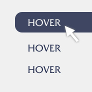
CSS3 Border Radius for Hover StatesOne of the huge benefits to using CSS3 is the ability to create image-like effects without the use of images. CSS3 gradients, shadows, and rounded corners have helped designers greatly in this area.
While browsing the website of well-known web hosting company Media Temple, I stumbled upon their Labs page and noticed they’re using a block hover effect on the list of items, and the hover state uses (what I assume is) the border-radius property when the background becomes visible.

Read Article

CSS3 Best Practices

CSS3 Best PracticesSince CSS3 has become such a big deal in the future-thinking minds of web designers today, I think it would be appropriate for front-end developers to begin formulating some best-practice habits and techniques so that any CSS3 development we do is done right, and we therefore are able to get CSS3 development off to a good start.

By no means do I assume that everything in this article is etched in stone and error-free, but I think this will be a good starting point for this topic, and I will be happy to add to or amend any points that anyone feels need adjusting or clarification.

Consider this a starting point for discussing best practices for CSS3, especially since there don’t seem to be any articles available yet that exclusively discuss CSS3 best practices.

Read Article

Using CSS3 Text Shadow for Active Link States

Using CSS3 Text Shadow for Active Link StatesRecently, Chris Spooner of Line25 wrote a tutorial describing how to create a letterpress effect with CSS3’s text-shadow property.

In another article, Chris Coyier of CSS Tricks showed how he makes all the text links on his website feel more button-like using a simple bit of CSS positioning.

During a recent project I was working on, while messing around with the CSS3 text-shadow property, I serendipitously came across a simple way to combine the two different effects from those two articles to create a letterpress effect on active link states.

Read Article