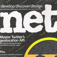
I especially appreciate articles written by familiar bloggers and designers from around the community, some of whom I’ve personally been privileged to interact with. The magazine’s editors truly go above and beyond to ensure they’ve (as they state on page 8 of every issue) “scoured the web” to find the web’s best talent. In recent months, they’ve published articles by Alen Grakalic, Soh Tanaka, and Chris Coyier, the latter of which was a major cover feature on WordPress. Many of us are no doubt familiar with those names, so it’s exciting to see them get such recognition.
But the magazine has its flaws, and although it’s (by default?) my favourite web design magazine, I still think it could be better. So here are my (admittedly whiny) complaints about .net magazine, and how I think it could improve.
The Name of the Magazine
What exactly does “dot net” mean, anyhow? I think it was a catchy name in the 90s before Microsoft started using it, but I can’t see why it would stick for this long as the title of a monthly web design mag. I understand that for marketing reasons changing the name may not be a good idea, but what about removing the dot, as some have suggested?

Although the name “Practical Web Design” isn’t as catchy, they do use it for the North American version of the magazine, showing that they partially recognize the weakness in the name. So, my opinion is, find a catchy, but more appropriate name that isn’t as ambiguous as “.net” and isn’t as boring as “Practical Web Design”.
Too Much Emphasis on Flash
Yes, I’m bashing Flash — deal with it. It seems to me that the U.K. and European markets appreciate Flash-based applications and websites a lot more than their North American counterparts. I’m not sure if that’s good or bad, but I think it would explain the reason that .net continues to promote Flash-based content. There’s a Flash tutorial pretty much every month , and many of the sites featured and discussed throughout the magazine are Flash-based.
A perfect example is the website of the Cheese & Burger Society shown above, which was featured in a recent issue where the creators discussed how they built it. It’s a beautiful, creative, and inspiring website, and the discussion of how the site came about was very interesting. But how practical is it as an example for the majority of developers?
Obviously Flash is a big part of the web design industry — but I think .net could do more to help educate users on accessibility and web standards, and not put so much focus on bloated, superficial websites.
Not Enough Practical Tips and Techniques
The magazine contains a good amount of info covering CSS, JavaScript, HTML, and PHP tips. But that type of content is quite minimal when you compare it with the content covering web marketing, hardware, security, social media and other topics that might relate well to large design agencies, but may not be so practical for beginning to intermediate designers, developers, and freelancers.
Many of the interviews are not really all that practical. There’s often a lot of info on theoretical marketing and other somewhat generalized topics, but the magazine is somewhat lacking in practical down-to-earth articles discussing things that most web developers can actually use. Years ago, .net magazine was sold as part of a 2-magazine set, the other called “Web Builder”. So maybe during that time attempts were made to separate theory from practical tips — I don’t know.
As much as I appreciate what the magazine offers, I just think it could offer more. Of course, the argument could be made that straight tips and tutorials are already provided online in great abundance. So maybe the balance they provide is just right. But sometimes I finish reading an issue and, although thoroughly entertained, didn’t find a whole lot that I could use in any immediate situation.
Too Much Info on Social Media and Related Topics
Yes, social media is important. Yes, every developer should have a Twitter account and a Facebook page, and a LinkedIn profile, etc. And there is enough information and news on the web that could fill entire volumes discussing social media and its relevance on the web. But again, how much of the magazine’s content related to social media is actually practical, or immediately usable?
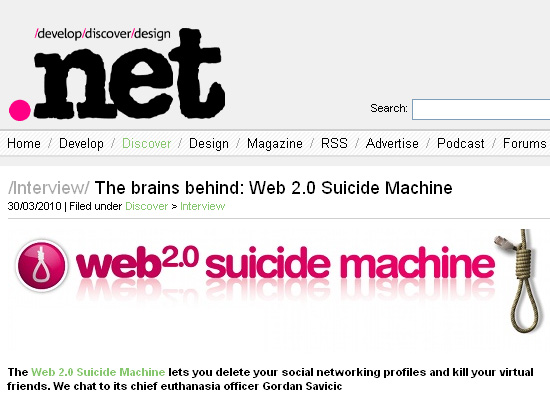
I guess a large focus of the site is similar to what you find on sites like Mashable, Slashdot, and Engadget. Those sites provide interesting and valuable content, but I would hardly deem those sites required reading for web designers.
How Could the Magazine Improve?
More emphasis on website creation, including practical tips related to coding websites using XHTML, HTML5, CSS2, CSS3, PHP, Ruby, JavaScript, JavaScript libraries, WordPress, and application Frameworks like Drupal and Joomla.
More emphasis on web standards, accessibility, progressive enhancement, and the state of HTML and CSS specifications on current and proposed standards. More tips on improving page speed and website performance. More info on browser developments, cross-browser coding solutions, and browser bugs and pitfalls.
More practical tips on freelancing and project management, including dealing with clients from the start of a project to its completion.
More emphasis on creating and maintaining JavaScript and Ajax-driven web apps.
More emphasis on content strategy, information architecture, and usability — all of which should be presented in real-world, practical articles that people can use almost immediately.
What Do You Think?
Sure, I don’t run a big magazine, and I have no idea the complexity of the challenges the authors and edtors of .net have to face, or the pressure put on them by advertisers. I also have no idea what kinds of changes they’ve made over the years, since I’ve only been reading the magazine for about two and a half years. So maybe my recommendations here are out of line, and I’m not seeing the big picture.
But I do think the magazine could be more focused, and more driven towards helping developers in real-world ways, and have less emphasis on news and passing trends that have little or no impact on most people in our profession.




The obsession with flash is why I bought a couple of issues and gave up on it.
I wanted a mag on internet development, not graphic design.
Same here Jason
Interesting read. As a lot of ‘us’ are involved in a variety of areas of the web (dev, design, SEO, coding etc etc) and we’re all reading, it’s probably really hard for them to find the balance. I’d prefer to see less Flash in the showcase section as well, but as unusable as they sometimes are, they often provide unique/interesting layouts, designs and navigations. It’s a tough one,,, glad I’m not the editor! Overall I think they do a pretty good job. 9.215 out of 10 from me.
I totally agree with you especially your suggested improvements there is not enough coding and everyday scenarios covered for my liking. Instead they focus on larger agency’s or short interviews which sort of explain how things were achieved but I think should be expanded upon.
I appreciate the printed media world is a hard one but the ever increasing cost and thinner content and many more adverts than before, now make this a flick through in the shop and occasional buy for me.
I hate it because I can’t subscribe to it from USA.
Serg, I think you’re mistaken. I’m in Canada and I have a subscription. Go to this link, which is an offer through Carsonified/Think Vitamin, with a special price for the subscription:
http://www.myfavouritemagazines.co.uk/store/displaystore.asp?sid=4027
You’ll see that it says “USA and Canada subscribers…” with a link and promo code.
Serg, I’m in the US and have been a subscriber for several years now. You can either go through their site, subscribe at Amazon.com or buy it from some of the big bookstores. I recommend direct through them. Often it is called “Practical Web Design” in the US I believe.
Not the cheapest of mags here, but much better than the other options here.
I love the magazine…I HATE THE CD…everything on that cd is absolutely useless. No more crappy app demo’s, and silly dhtml apps and such that no one EVER uses. They write articles with the top 60 apps of webdesign, and yet not once has any of those apps been a free give-away or even a demo.
Revamp that disc …more usable vector files, photoshop brush packs, assembled code packages, great free videos … Anything more usefull…I’ve had a subscription for 2 years…I’ve probably only put the cd in my computer once…
My 2 cents anyhow!
Cheers.
+100
Totally agree, although I’m sorted for frisbees, coasters, bird scarers and cot mobiles for my baby now…
I agree.
I think they once had a cd which promised tons on back issues. “Excellent!”, I thought… but when it arrived all of the pdfs were of the LOWEST quality, with jpgs saved at about 40%… not pretty at all.
I have to agree, I was a long time reader of the magazine, now I tend to look through it first before buying it and the decision to purchase is getting less and less frequent.
For me, the magazine is too flash based, there isn’t enough variety, I find online blogs such as this one (and other similar ones!) much more useful and enjoyable.
As for the CD, back in the late 90’s/early 00’s, I’d say that those CDs were very useful, always full of quality applications (such as the infamous Paint Shop Pro demos that would never expire! and mp3 conversions) – although that was largley due to the fact that connection was so slow in the UK, any app was good to have on CD.
I definitely agree in principle, because although I’ve never conciously read .net (I may have done and forgotten) I remember reading lots of ‘web design and development’ publications years and years ago before the whole blog community thing took off, and as you’ve said, it was too much flash and not enough real substance in the way of tip, tutorials and general education.
I’d love to see a magazine which focused on core web development – HTML, CSS, PHP, MySQL, Servers etc. with the odd tutorial – but I’d rather read about PHP in general and learn to apply it to wordpress, rather than just be spoonfed snippets of code and plugins.
From what I remember there was too much emphasis on design too.
Anyone fancy helping me write one?
>>Anyone fancy helping me write one?
You might find some interest here:
http://www.sitepoint.com
In the way of tip, tutorials and general education, it definitely developed the wide array of communication that is why I believe in the progress of the whole blog community.
Why I hate it:
Flash Trash. Not enough practical stuff (code, etc.). The CD is garbage. It costs like 18 bucks in the states.
I’m so ashamed that I still have not read this magazine before.
Now at least I know what to expect from .net magazine.
Thanks for the insight, Louis!
I think it is a point of justification for me. I do enjoy reading it and have gotten some useful information out of it, but being in the US it costs me almost $20 which is not a lot of money, but for a mag i may only end up skimming through is not justifiable.
I also agree with most about not liking the CD. I believe if they were to load it up with useful stuff it may just justify its purchase for me.
I agree with the points you make. I live in the UK, buy .net, Computer Arts and Web Designer. So I spend a lot on these resources.
Why do I buy all these, well I get my design fix from one, my developing fix from another and well Web Designer started me in the webdesign direction.
The only one of these I have on subscription is .net.
Web Designer seems to be under Adobe’s spell. Last month they published a tutorial completed in Coda but still had to use the Dw icon on the page?! .net would never stoop so low.
The improvements you mention would indeed be welcomed, but for anyone out there who has any interest in developing for the web, you wont find a better read.
The reasons you laid out are the exact reasons why I stopped my subscription.
In the end I found that I wasn’t even reading them so much as leafing through and realizing I’d read it all on blogs.
Love the burger website that looks awesome truly a masterpiece IMO
Flash – its had its day…its only real place these days is for big expensive product pushing sites – not much use on a smaller scale for the majority of people reading the mag…would like to see some more useful coverage showing more interesting CSS based design that has a far wider appeal & usefulness.
I buy the mag every couple of months…its rare for me to actually read more than one full article in a single issue – as for the cd…all mine are protecting my shallots from the pigeons, they’ve never been in my computer.
Having subscribed to .net mag for some 18months, having launched a new design/development business, for some 6 months I waited for some earth shattering, cutting edge new learning … it just never came. Sadly, I cut my subscription as I could learn far more from subscribing to the right online rss feeds and online news articles. Inspiration, cutting edge development and business progress is derived from being intouch with what is today and now, rather than what is one month, what is believed to be important from one editor and not focussing on limited applications. Sorry .net, good, but not good for a long term subscription.
I too love .net, but your comments are spot on. I agree with you 100%, especially your thoughts on it featuring too much Flash and of course the name. Thanks!
very well written article……..useful stuff
Sorry but I don’t agree, I subcribe to the magazine 4 years running and I LOVE the Flash content, I think .net has a very good allround content and should be kept that way.
I’d like to see more emphasis on CSS/HTML innovation rather than Flash based sites in the ‘Gallery’ section.
Have to agree with comments on the disc content aswell – I’d like to see more exclusive content that is actually useful for designers, like brushes, vectors, textures, fonts etc. I always read the book extracts though and the tutorial source files are useful.
On the whole the mag content is excellent considering the breadth of areas they need to cover.
Living in Italy, what really s**ks for me is the delivery time: I am still waiting today for the last 2 issues, ordered on march 5th, and every time it’s the same story.
I would be glad to pay an extra on delivery to receive the issues on the same year I ordered them..
thanks for informing.
I actually prefer this mag – http://www.webdesignermag.co.uk/
I just wish they had shipment to my country too, really want to become a constant reader of this magazine, this article gave me so much in depth insights about this magazine, but as you said in the beginning of your article it’s a must read.
Thanks anyhow for the article
Good magazine, but I agree – less focus on Flash would be nice. Overall though, they cover some great stuff. I prefer them to Web Designer, but frankly nothing beats the ultimate free alternative: Smashing Magazine (www.smashingmagazine.com).
I agree — tutorials are rarely as deep as they should be, content on CD has way too many trial applications, also too many puff pieces on “stars” of the internet instead of real world case studies. However, I always find something useful in each issue that justifies the $125 US subscription, and while there might only be one tutorial that is useful for my work, they are pretty well written and edited, which is rarely the case with random online tutorials. Would be nice if they dropped the cd and lowered the price.